Removing pre-15.3 Kiosk Customizations (macOS/Windows)
Requires FileWave version 12.2.0 or greater.
Prior to FileWave 12.2, there were a few things that could be customized in the desktop Kiosk, such as the window title and the logo. In FileWave 12.2, support for creating custom desktop kiosk styles was added, extending the previously existing customization possibilities.
The look of the FileWave desktop Kiosk can be customized using Qt Style Sheets. You have to create a file named fwGUI.qss and deploy it to clients in the right location. Several icons are now also customizable by placing your custom icon in the right place with the right file name. All of this can be deployed via a fileset. If you already had pre-12.2 customizations, you can simply extend them by adding fwGUI.qss as well as your custom icons to your existing fileset. Pre-12.2 clients will simply ignore the style sheet and new icons, but will continue to work, whereas newer clients will exhibit your custom look.
See also: iOS Kiosk styling
Create
The syntax of Qt Style Sheets is similar to CSS, though there are some differences. If you want to learn more about the syntax, check "The Style Sheet Syntax". This page contains several examples that will help you better understand it.
In order to make it easier to customize the dialogs, every widget has a unique descriptive name. You can use style sheet selectors to refer to a particular widget. Besides, there are some additional properties that can be used to select several widgets that have something in common with a single selector (e.g. "select all field names"). The list of all widget names and properties is defined below, in Styling rules.
Deploy
Create a fileset containing the fwGUI.qss and the icons, then associate it to the desired clients. The directory where these files should be placed depends on the operating system:
macOS
/usr/local/sbin/FileWave.app/Contents/Resources/fwGUI.app/Contents/customWindows
C:\Program Files\FileWave\custom (might be "Program Files (x86)", depending on the platform)The changes will only be visible in the desktop Kiosk after the user logs out and logs in again.
Menu Bar/System Tray Settings
settings.ini -- contains generic kiosk ui settings:
Example
window_title = "Your New Window Title"
show_top_downloads = true
hide_system_tray = false-
The "window_title" attribute will be displayed in the menu bar menu item - as well as in the kiosk window title area.
-
The "show_top_downloads" attribute can be used to hide the top downloads UI on a per client basis.
-
"hide_system_tray" determines whether or not there will be an icon displayed in the system tray. Setting 'false' will force the Kiosk to show even with no current association.
Example Filesets
Windows (64) - Kiosk_Customizer_for_Windows64.fileset.zip
Windows (32) - Kiosk_Customizer_for_Windows32.fileset.zip
macOS - Kiosk_Customizer_for_macOS.fileset.zip
macOS/Windows - Applications Preventing Reboot
Customizable icons
| File name | FileWave Version | Description | Example | Pixel Size |
| action_back.png | 12.2+ | Icon for the "Back" action in the Software Installation dialog |  |
48x48 |
| action_forward.png | 12.2+ | Icon for the "Forward" action in the Software Installation dialog |  |
48x48 |
| background_icon.png | <12.2 | Icon used for the watermark | (FileWave icon) | 512x512 |
| rating_star_half.png | 12.2+ | Icon for half a rating star |  |
40x40 |
| rating_star_off.png | 12.2+ | Icon for a rating star that is off |  |
40x40 |
| rating_star_on.png | 12.2+ | Icon for a rating star that is on |  |
40x40 |
| tray_icon.png | 12.2+ | System tray icon. If missing, the background_icon.png is used. | (FileWave icon) | 16x16 |
| warning.png | 12.2+ | Warning icon, displayed when a fileset has problems (e.g. missing VPP user) |  |
64x64 |
Styling rules
Client Info dialog
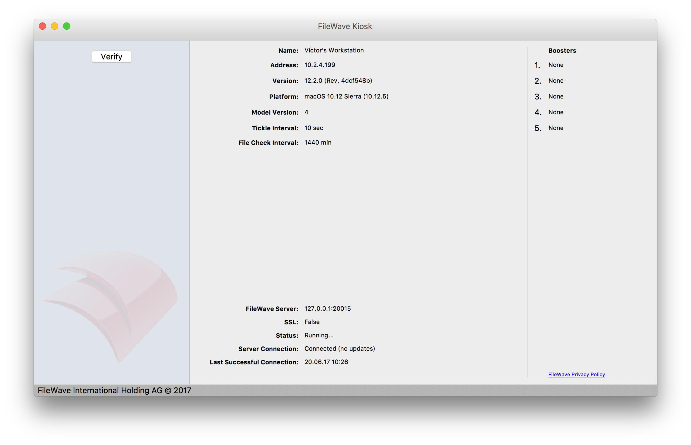
The client info dialog is called "KioskClientInfo". Whenever styling widgets in this dialog, prefix all CSS rules with it.
The main contents of this dialog is a list of field names with their corresponding values. All labels displaying the name of the field are suffixed with "Label", whereas all labels displaying their corresponding values are suffixed with "Field".
List of widgets
| Widget name | Description | Example value (see screenshot above) | Widget type |
| toolBar | Toolbar (currently empty) | QToolBar | |
| centralWidget | Container widget for all contents of the dialog (except tool bar and status bar) | QWidget | |
| leftPane | Left pane, which contains the "Verify" button and the watermark | QTreeView | |
| verifyButton | The "Verify" button | Verify | QPushButton |
| installSplitter | Splitter between the left pane and the list of fields on the right side | QSplitter | |
| nameLabel | "Name" label | Name | QLabel |
| nameField | Value of the "Name" field | Víctor's Workstation | QLabel |
| addressLabel | "Address" label | Address | QLabel |
| addressField | Value of the "Address" field | 10.2.4.199 | QLabel |
| versionLabel | "Version" label | Version | QLabel |
| versionField | Value of the "Version" field | 12.2.0 (Rev. 4dcf548b) | QLabel |
| platformLabel | "Platform" label | Platform | QLabel |
| platformField | Value of the "Platform" field | macOS 10.12 Sierra (10.12.5) | QLabel |
| modelVersionLabel | "Model Version" label | Model Version | QLabel |
| modelVersionField | Value of the "Model Version" field | 4 | QLabel |
| tickleIntervalLabel | "Tickle Interval" label | Tickle Interval | QLabel |
| tickleIntervalField | Value of the "Tickle Interval" field | 10 sec | QLabel |
| fileCheckIntervalLabel | "File Check Interval" label | File Check Interval | QLabel |
| fileCheckIntervalField | Value of the "File Check Interval" field | 1440 min | QLabel |
| filewaveServerLabel | "FileWave Server" label | FileWave Server | QLabel |
| filewaveServerField | Value of the "FileWave Server" field | 127.0.0.1:20015 | QLabel |
| sslLabel | "SSL" label | SSL | QLabel |
| sslField | Value of the "SSL" field | False | QLabel |
| statusLabel | "Status" label | Status | QLabel |
| statusField | Value of the "Status" field | Running... | QLabel |
| serverConnectionLabel | "Server Connection" label | Server Connection | QLabel |
| serverConnectionField | Value of the "Server Connection" field | Connected (no updates) | QLabel |
| lastConnectionAttemptLabel | "Last Connection Attempt" label | Last Connection Attempt | QLabel |
| lastConnectionAttemptField | Value of the "Last Connection Attempt" field | 20.06.17 10:26 | QLabel |
| paneSeparator | Vertical line separating the kiosk status and the list of Boosters | QFrame | |
| boostersLabel | "Boosters" label | Boosters | QLabel |
| booster1Label | "1." label referring to the first Booster | 1. | QLabel |
| booster1Field | Address of the first configured Booster | None | QLabel |
| booster2Label | "2." label referring to the second Booster | 2. | QLabel |
| booster2Field | Address of the second configured Booster | None | QLabel |
| booster3Label | "3." label referring to the third Booster | 3. | QLabel |
| booster3Field | Address of the third configured Booster | None | QLabel |
| booster4Label | "4." label referring to the fourth Booster | 4. | QLabel |
| booster4Field | Address of the fourth configured Booster | None | QLabel |
| booster5Label | "5." label referring to the fifth Booster | 5. | QLabel |
| booster5Field | Address of the fifth configured Booster | None | QLabel |
| privacyPolicyLabel | A link that opens the FileWave privacy policy in an external browser. The link color cannot be customized using Qt Style Sheets. Use the key "link_color" in settings.ini instead (e.g.: link_color="#FF0000"). | FileWave Privacy Policy | QLabel |
| bottomLine | A horizontal line displayed immediately above the status bar | QFrame | |
| statusBar | Status bar | QStatusBar |
Special properties
Labels in this dialog have the following properties:
| Property | Description | Possible values |
| type | "fieldName" means that this label displays the name of a field. "fieldValue" means that this label displays the value of a field. "other" applies to all other labels. | * fieldName * fieldValue * other |
Example rules
Example
/* makes the background of the left pane white */
KioskClientInfo #leftPane {
    background: white;
}
/* makes the paneSeparator look as a 1 pixel gray vertical line */
KioskClientInfo #paneSeparator {
    border: none;
    max-width: 1px;
    background-color: #C9C9C9;
}
/* makes the "Boosters" label be displayed normal instead of bold */
KioskClientInfo #boostersLabel {
    font-weight: normal;
}
/* makes all field labels blue */
KioskClientInfo QLabel[type="fieldName"] {
    color: blue;
}
Software Installation dialog
The software installation dialog is called "Kiosk". Whenever styling widgets in this dialog, prefix all CSS rules with it.
This dialog contains the list of filesets that are available for installation via the Kiosk. It also displays details about a fileset when clicking it.
List of widgets
| Widget name | Description | Example value (see screenshot above) | Widget type |
| toolBar | Toolbar | QToolBar | |
| actionBack | The "Back" action in the toolbar | QToolButton | |
| actionForward | The "Forward" action in the toolbar | QToolButton | |
| filesetStatusCombo | The fileset status combo box in the toolbar | All Items | QComboBox |
| searchField | The search box in the toolbar (currently not customizable) | ||
| categoriesView | List of categories | All (7) | QTreeView |
| categoriesOrganizationsSplitter | A splitter between the list of categories and the list of organizations | QSplitter | |
| organizationsLabel | The "Organizations" label below the list of categories (might be hidden) | Organizations | QLabel |
| organizationsView | The list of VPP users, below the Organizations label (might be hidden) | QTreeView | |
| installSplitter | A splitter between the left pane (categories/organizations) and the list of filesets | QSplitter | |
| listView | Widget that contains the whole list of filesets | QWidget | |
| filesetListView | The list of filesets | QTreeView | |
| topTenScrollArea | The area that contains the list of top ten items. See below for details. | QScrollArea | |
| topDownloadsLabel | The "Top Downloads" label that serves as title for the top ten area. | Top Downloads | QLabel |
| bottomLine | A horizontal line displayed immediately above the status bar | QFrame | |
| statusBar | Status bar | QStatusBar |
Fileset Items
Each row in the list of filesets is a widget. When creating rules for these rows, always prepend "Kiosk #filesetListView" to your selectors. Fileset rows are made up from the following widgets:
| Widget name | Description | Example value (see screenshot above) | Widget type |
| KioskInstallWidget | Represents a whole row displaying information about one fileset | KioskInstallWidget | |
| iconLabel | The icon | QLabel | |
| titleLabel | The fileset name | Atom | QLabel |
| categoryLabel | The category of the fileset | Applications | QLabel |
| descriptionBrowser | Displays the first line of the description | Let Evernote change the way you organize your personal and professional projects... | QTextBrowser |
| rating | Displays the rating of the fileset (if available). The icons can be customized. See "Customizable icons" above. | ||
| statusLabel | Displays the warning icon. This icon can be customized. See "Customizable icons" above. | (exclamation mark icon) | QLabel |
| installButton | The Install/Get license button. | Install | QPushButton |
| progressBar | The installation progress bar | QProgressBar | |
| moreLessButton | The "More" link. Must be customized as a QPushButton. | More | QPushButton |
Top Ten Items
The "Top Downloads" pane contains a list of top ten items. When creating rules for these items, always prepend "Kiosk #topTenScrollASrea" to your selectors. Each top ten item consists of the following widgets:
| Widget name | Description | Example value (see screenshot above) | Widget type |
| icon | Icon | (firefox icon) | QLabel |
| nameField | Fileset name | Firefox | QLabel |
Fileset Details
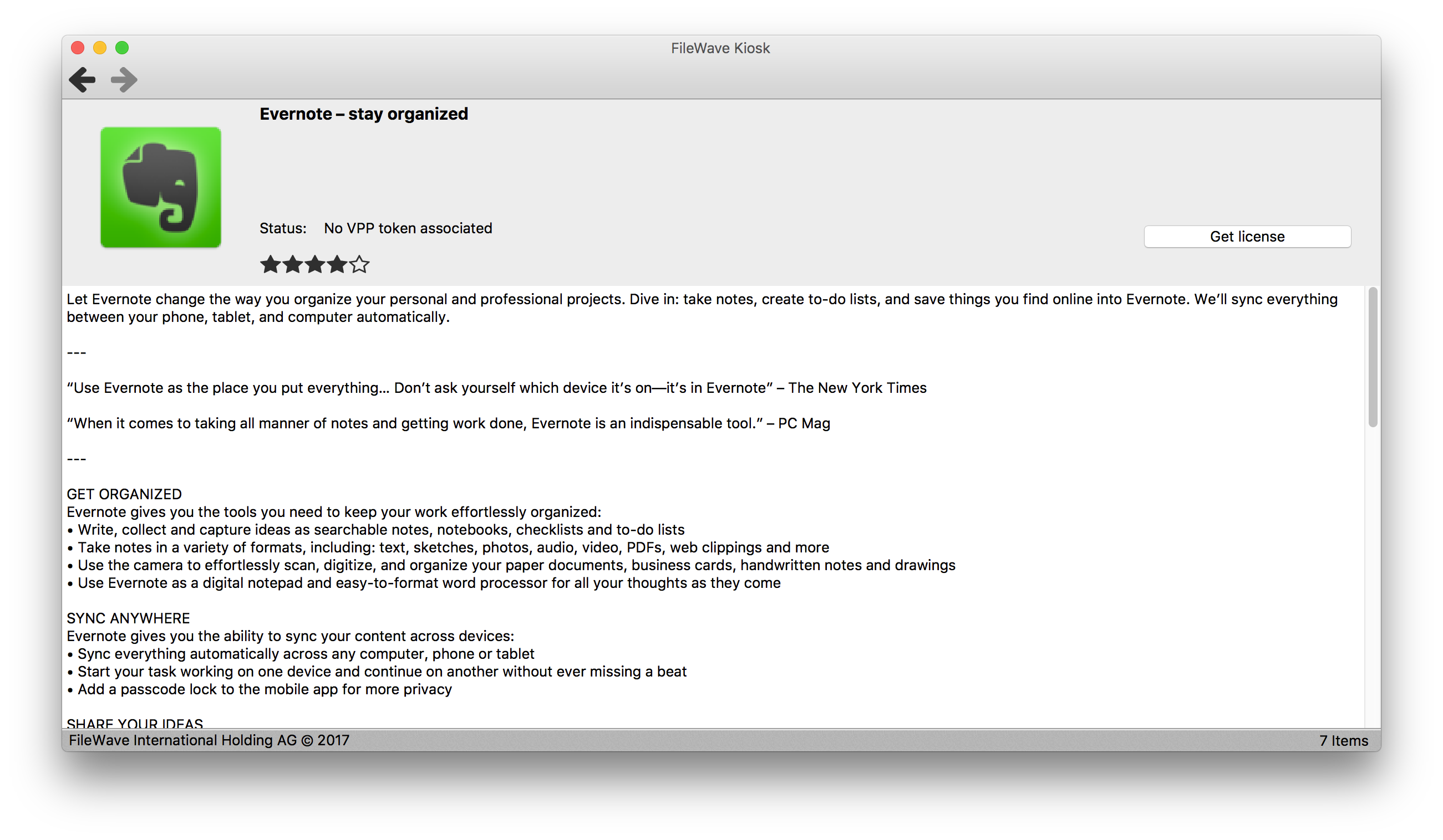
When clicking a fileset, the fileset details is revealed. This is a part of the software installation dialog, hence it shares parts of the dialog such as the toolbar and the statusbar. When creating rules for this widget, always prepend "Kiosk #detailView" to your selectors. The fileset details is made up of the following widgets:
| Widget name | Description | Example value (see screenshot above) | Widget type |
| detailView | Widget that contains the whole fileset details | QWidget | |
| icon | Icon | QLabel | |
| titleField | The fileset name | Evernote - stay organized | QLabel |
| categoryField | The category of the fileset | (empty in this screenshot) | QLabel |
| statusLabel | The "Status:" label | Status: | QLabel |
| statusField | Label that displays the current status | No VPP token associated | QLabel |
| rating | The rating | (4/5 stars) | |
| installButton | The Install/Get license button | Get license | QPushButton |
| installProgressBar | Shows the progress of the installation. Visible only while the installation is in progress. | QProgressBar | |
| descriptionView | Detailed description of the fileset. | Let Evernote change the way you organize your... | QTextBrowser |
Example rules
Example
/* add a top and bottom margin to the toolbar */ Kiosk QToolBar QToolButton { margin-top: 5px; margin-bottom: 5px; }
/* add a margin and a gray top border to the descriptionView */
Kiosk #detailView #descriptionView {
    margin-left: 10px;
    margin-right: 10px;
    margin-bottom: 10px;
    border-top: 1px solid #CFCFCF;
    padding-top: 10px;
}
/* make all buttons in all dialogs blue */
QPushButton {
    padding: 10px;
    border: 1px solid #0000ff;
    background-color: #0000ff;
    color: white;
}
QPushButton:pressed {
    border-color: #4040ff;
    background-color: #4040ff;
    padding-top: 11px;
    padding-left: 11px;
    padding-bottom: 9px;
    padding-right: 9px;
}
On May 19, 2021 at the Alliance eMeeting a presentation on this topic was shared. Below is a copy of that presentation to help show the different levels of customization that are possible in the product:
eMeeting - Kiosk Customization.pdf