FileWave Kiosk for macOS and Windows overview (15.3+)
This article will explain the details of the refreshed Kiosk for macOS and Windows that is included in FileWave 15.3+.
Browse Payloads/Filesets
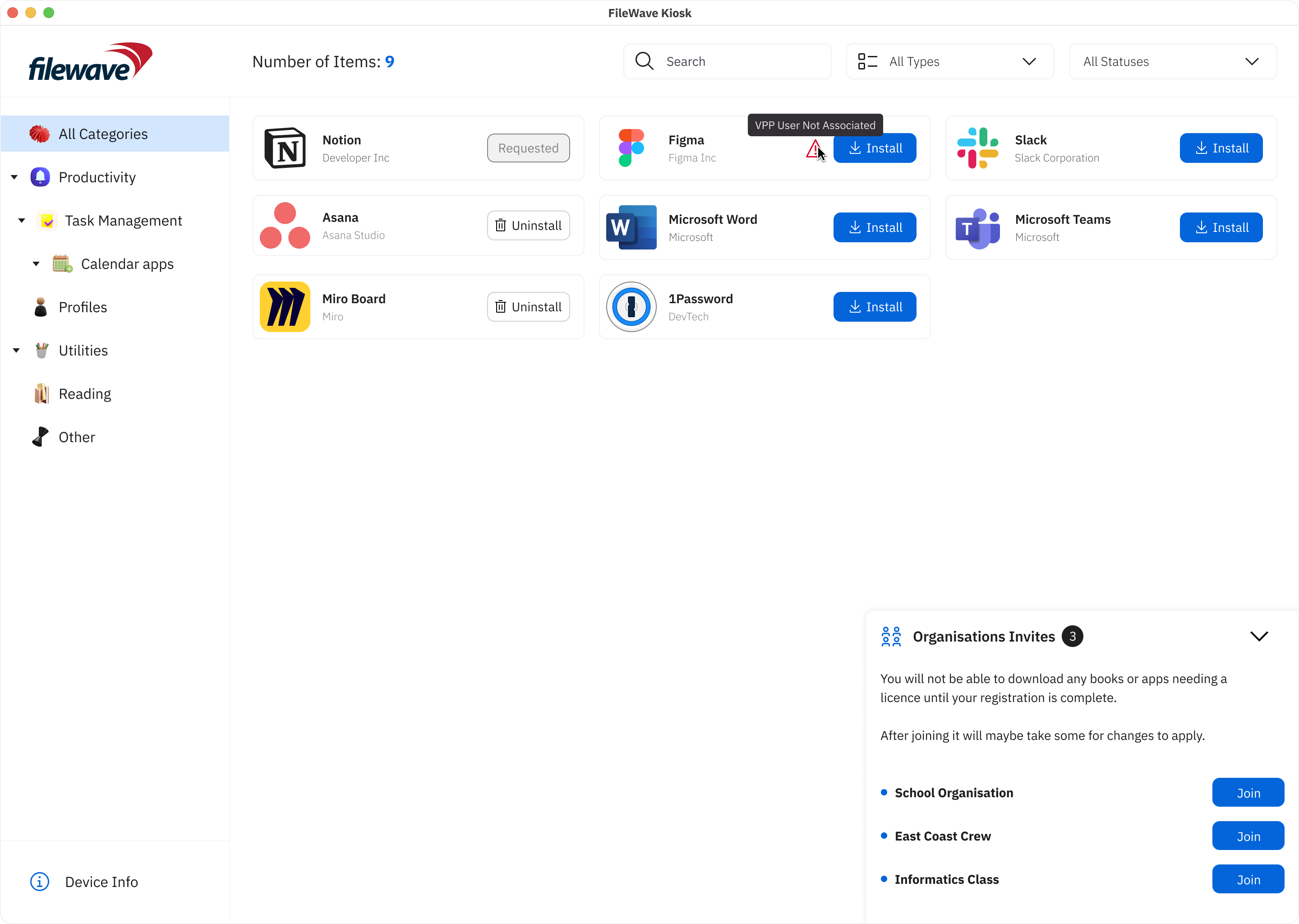
The "Browse Payloads/Filesets" screen is a central feature within the app that enables users to explore and discover a diverse array of payloads/filesets available for access or download. Much like the experience of browsing through the Android Play Store or the Apple App Store, this screen offers users an organized and visually appealing interface that showcases different payloads/filesets, each accompanied by relevant details and information.
Key components and elements commonly found on the "Browse Payloads/Filesets" screen include:
- Company Logo: The visual representation of the company's logo, reinforcing brand identity and providing a familiar visual reference.
- Device Info: A button leading to the "Device Information" page provides users with quick access to essential insights about specific devices, such as company details, enrollment information, verification status, and app version.
- Payload/Fileset icon: Each payload/fileset is represented by an icon that provides a visual cue of its content or purpose.
- Payload/Fileset Name: The name of the payload/fileset is displayed alongside the corresponding thumbnail. This gives users a quick understanding of the payload's/fileset's context.
- Install/Uninstall Button: This view includes an "Install"/”Uninstall” button that users can click to initiate the installation/uninstallation process of the selected payload/fileset, streamlining the user's interaction and providing a clear call to action.
- Reinstall Button: This button is visible in two cases (for non-VPP filesets):
- When the user tried to install fileset, and installation failed for some reason:
- When the fileset is already installed on the device.
- Button Behavior: The installation process is now accompanied by clear button states, reflecting the various stages:
- Install: Initiates the installation process.
- Requested: Indicates that an installation request is pending.
- Uninstall: Allows users to uninstall the selected payload/fileset.
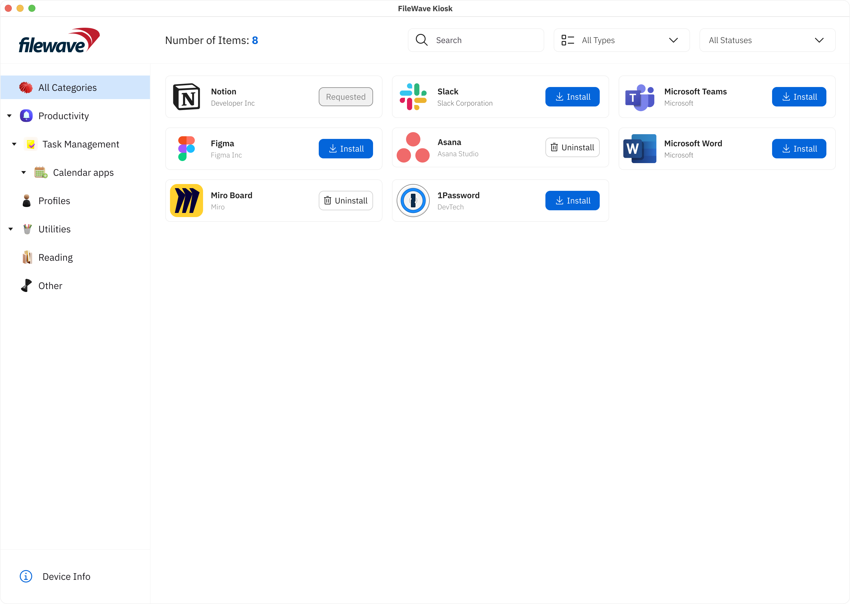
- Number of items: The number of items shows how many items are visible on the screen.
- Search Box: A search box is conveniently integrated, empowering users to quickly locate specific payloads/filesets based on keywords. This feature enhances precision and accelerates the search process.
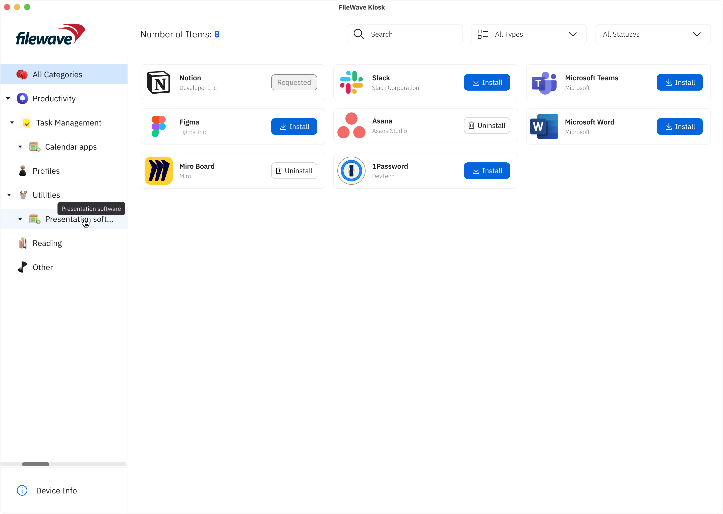
- Scalable Left Sidebar: Responding to user preferences, the left sidebar is now scalable, allowing users to customize its width, expanding or minimizing it based on their preference. This flexibility enables users to optimize their workspace, with the left sidebar scalable up to 50% of the screen size.

These enhancements not only simplify the user experience but also provide a comprehensive set of tools for effective payload/fileset management. By incorporating these features, we aim to empower users with a more personalized and efficient approach to navigating and managing their payloads/filesets within FileWave.
- Payload/Fileset Cards: Each payload/fileset is usually presented as a card containing its icon and name. Tapping on a card leads to a more detailed page for the payload/fileset.
- Pagination: If there are numerous payloads/filesets available, an infinite scrolling mechanism helps users navigate through multiple pages of listings.
- Scrolling Animations: Fluid scrolling animations and transitions contribute to a smooth browsing experience, enhancing users' engagement while exploring different payloads/filesets.
- Loading Animation: During data retrieval, a loading animation provides users with visual feedback, indicating that the app is actively fetching and populating the content.
- Error Handling: Robust error handling mechanisms ensure that clear and user-friendly error messages guide users in case of connectivity issues or technical glitches.
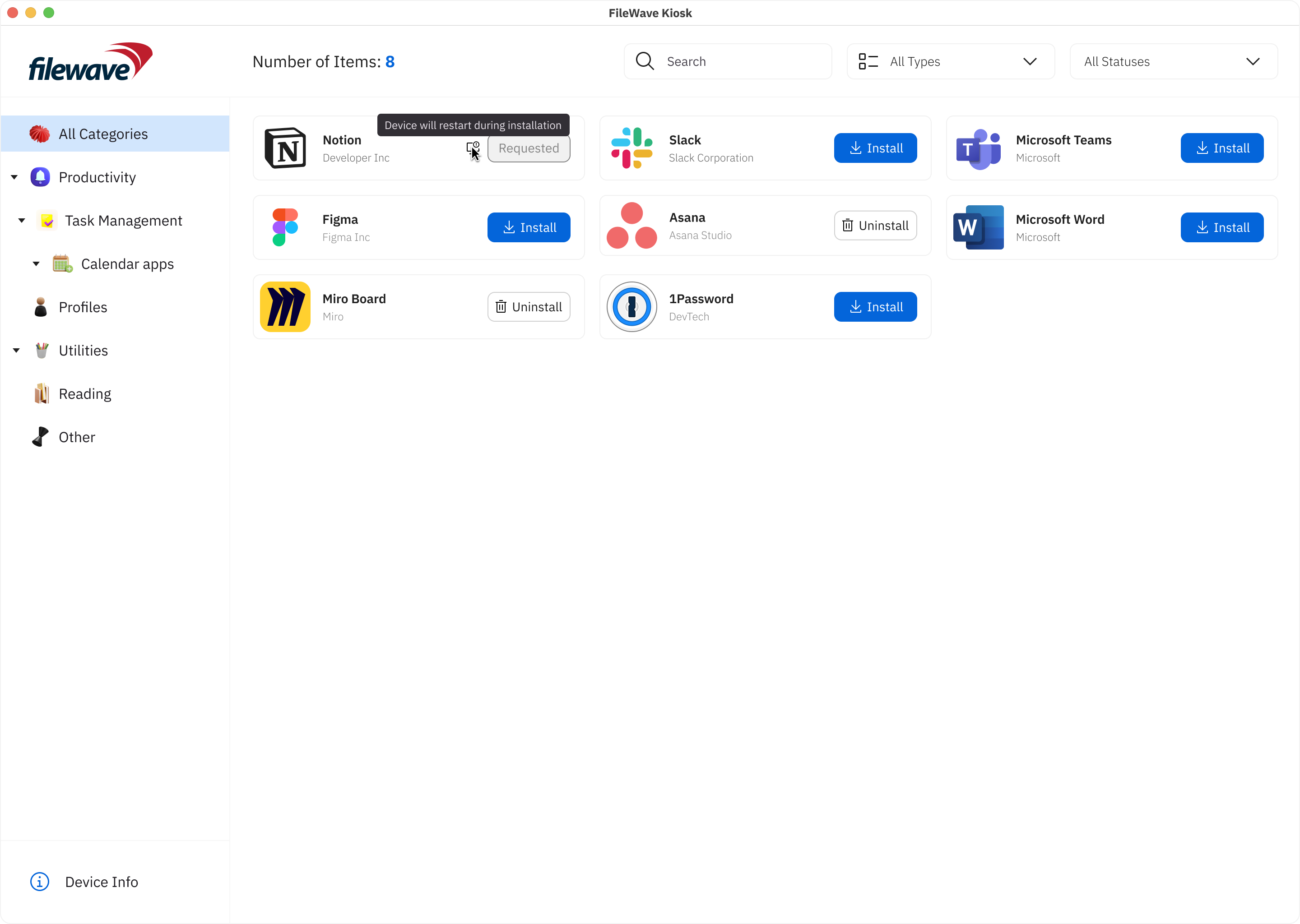
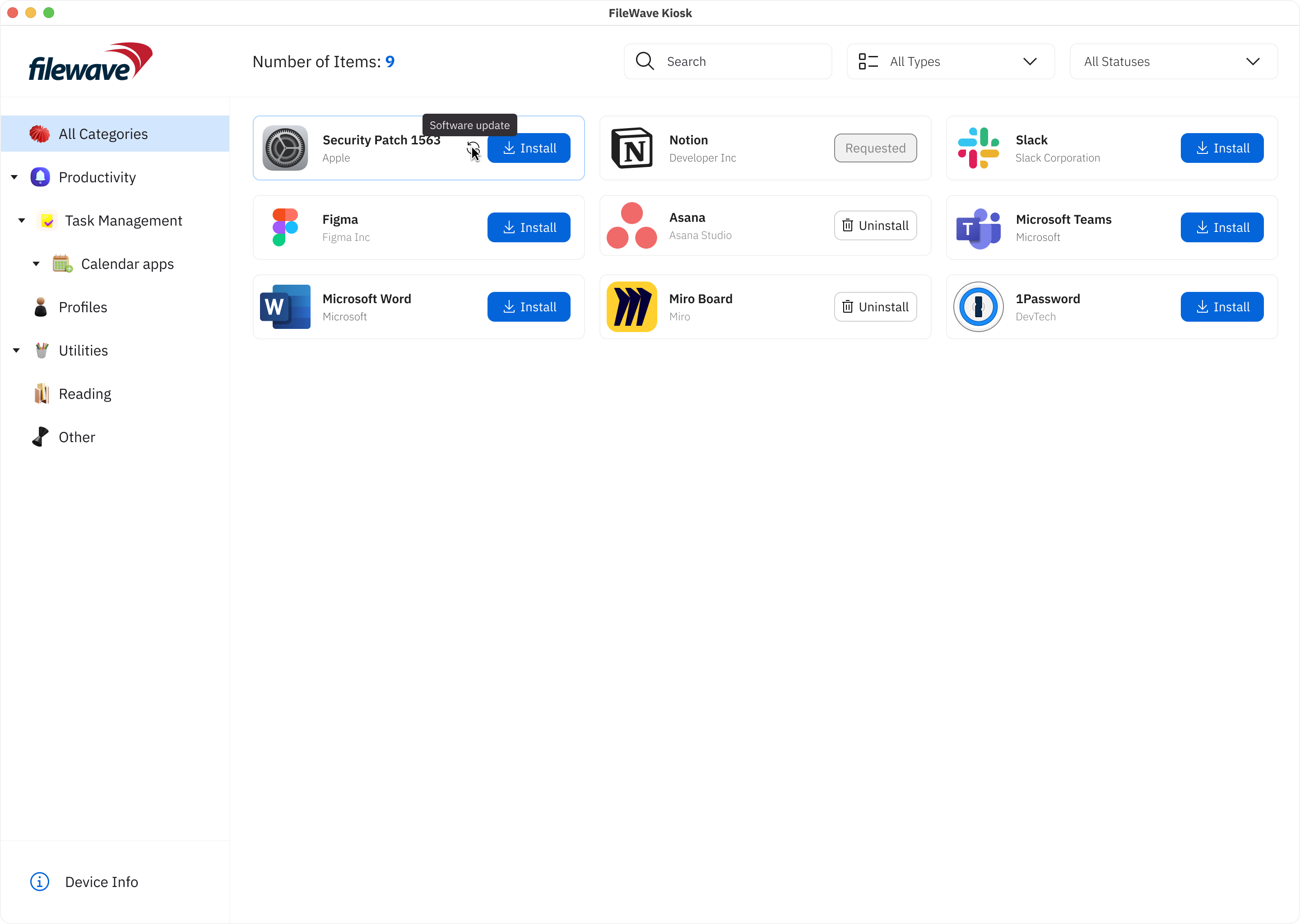
- Flags for Enhanced Communication: In the pursuit of transparent communication, we've introduced flags that offer clear insights into specific aspects of payloads/filesets. These flags include:
- Restart Needed: A flag signaling that the installation or update of a payload/fileset requires a system restart for the changes to take effect. This ensures users are promptly informed about necessary actions for seamless functionality.
- Software Update: This flag indicates that the payload/fileset represents a software update. Users will receive relevant messages, guiding them through the update process and ensuring they stay informed about crucial software enhancements.
- VPP support (macOS):
- JOIN Modal for Organization Selection:
- macOS users accessing the JOIN section will encounter a modal displaying a comprehensive list of organizations available for joining. This intuitive interface simplifies organization selection and facilitates seamless integration with VPP.
- Streamlined Registration Process:
- Upon selecting the "Join" button, macOS users will seamlessly transition to the App Store app to complete the registration process. This streamlined workflow minimizes user effort and enhances efficiency in finalizing organization registration.
- Dynamic Organization Visibility:
- Upon successful registration with an organization, it will be automatically removed from the list of available organizations. This dynamic update ensures that macOS users are presented with accurate and relevant options, optimizing their selection process.
- User-Friendly Interface:
- If there are no more organizations available for joining, the list at the bottom right will intelligently hide, providing a cleaner interface for macOS users. This decluttered view enhances user experience and facilitates focused decision-making.
- Compatibility with VPP Versions:
- Registration functionality is fully compatible with both VPP v1 and VPP v2, ensuring seamless integration and operation across different VPP versions for macOS users.
- Error handling (in case installation failed):
- Icons with error text tooltips are shown in the Apps List page, providing users with quick access to error information.
- JOIN Modal for Organization Selection:
Payload/Fileset details view
We are excited to introduce significant enhancements to the Desktop Kiosk versions, mirroring the user-centric improvements made for iOS/iPadOS. With these updates, users can expect a more intuitive and informative experience when interacting with filesets and payloads on their desktop devices.
Key Features:
- Details View Redesign:
- The "Details View" on Desktop Kiosk now mirrors the comprehensive and informative interface seen on iOS/iPadOS. Users encounter a screen that offers in-depth information about selected filesets/payloads, empowering them to make informed decisions.
- Key Elements and Components:
- Fileset/Payload Icon: Visual identifiers help users quickly recognize the selected fileset/payload.
- Fileset/Payload Name: Clear titles provide clarity about the content or purpose.
- Creator Information: Details about the developer or source establish credibility and context.
- Description: Comprehensive descriptions outline functionality, features, and benefits.
- Information: Users can access details like the last update date, version, and size of the fileset.
- User Interaction Buttons: Interactive buttons allow users to initiate actions such as installation, with progress updates visible until completion.
- Return to Browse: A back button facilitates seamless navigation back to the previous browsing screen.
- Scrolling Animations: Fluid animations enhance the browsing experience, providing engaging transitions between content.
- Loading Animation: Visual feedback informs users of data retrieval processes, ensuring they are aware of ongoing operations.
- Error Handling: Robust error messages guide users through connectivity issues or technical glitches, maintaining a smooth user experience.
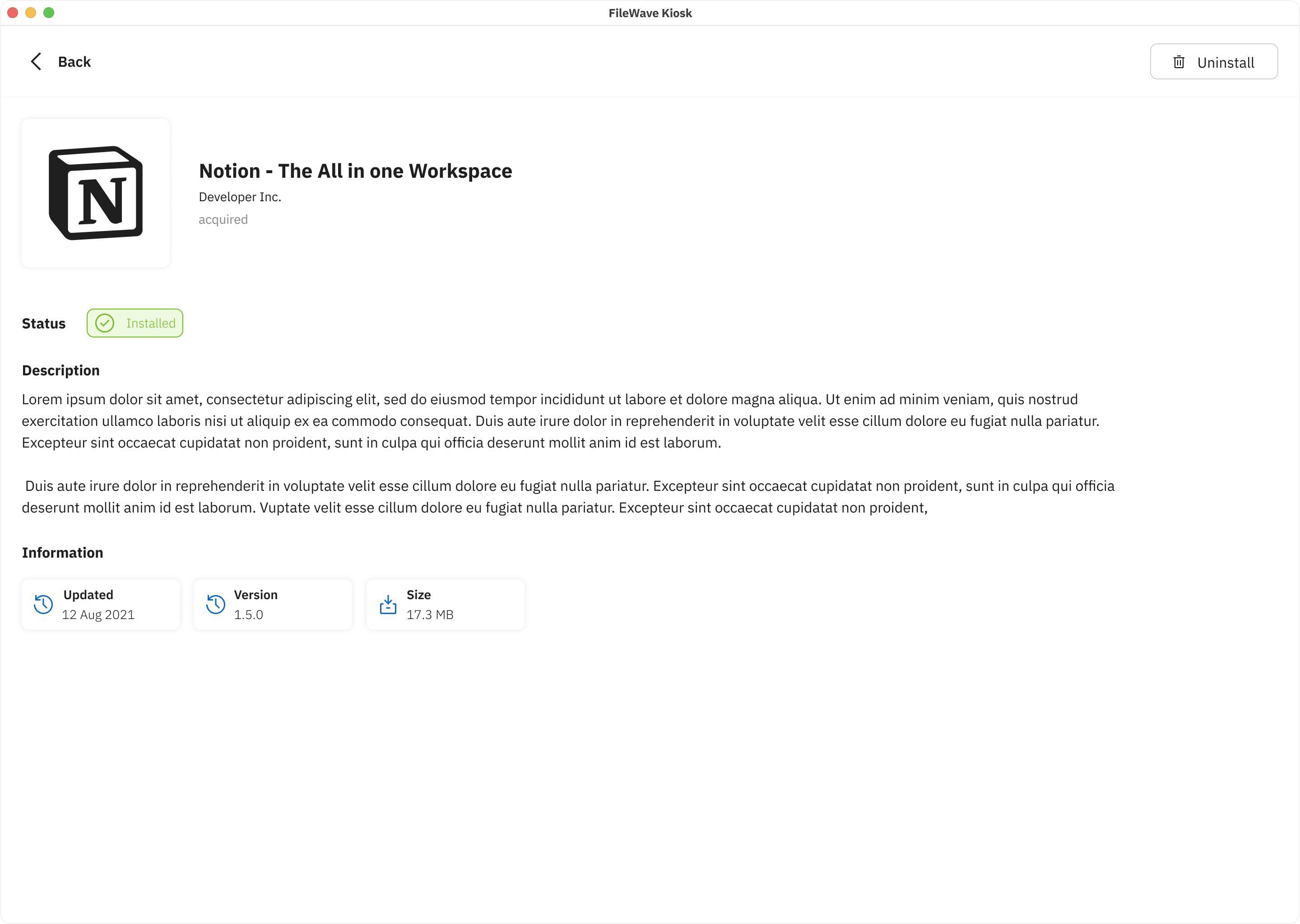
These enhancements aim to streamline the desktop browsing experience, aligning it closely with the intuitive interface seen on iOS/iPadOS. By providing users with comprehensive information and intuitive navigation, the Desktop Kiosk versions empower users to make informed decisions and maximize productivity.
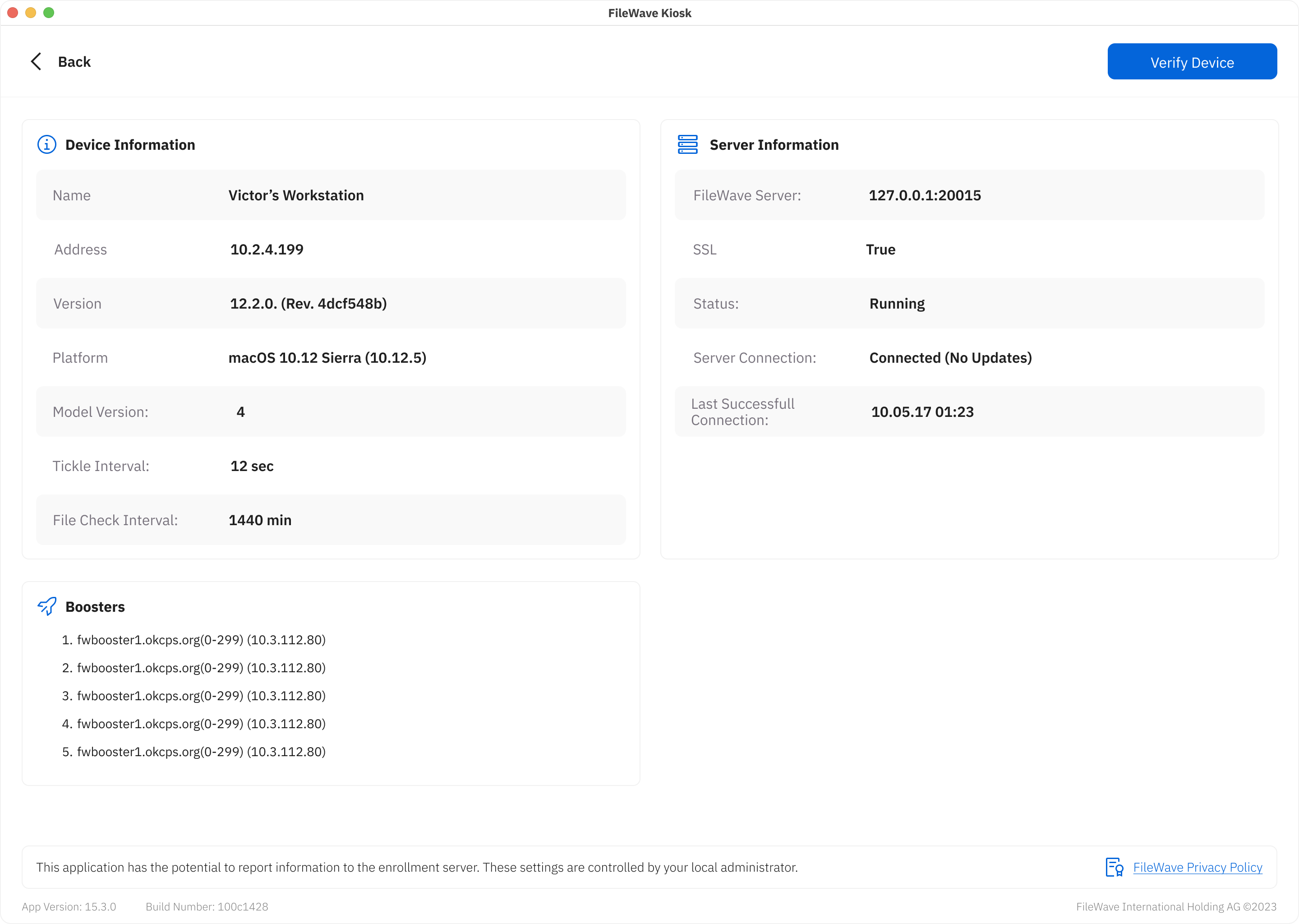
Device Information view
We're thrilled to unveil enhancements to the Device Information view on Desktop Kiosk, paralleling the user-centric improvements made for iOS/iPadOS. This revamped interface provides users with a comprehensive overview of vital device details, fostering transparency and effective management within the app's ecosystem.
Key Features:
These enhancements bolster transparency and facilitate efficient device management within the Desktop Kiosk environment. By providing users with a holistic overview of device and server information, coupled with booster management capabilities, the Desktop Kiosk version empowers users to make informed decisions and optimize their workflows with ease.
Logo and primary color selection
The Adding Logo and Primary Color Selection feature enhances customization within the app by enabling users to personalize the visual representation of their profiles or entities. This feature allows users to define their brand identity and establish a cohesive look and feel throughout the app. Here's how the feature works:
- Logo Upload: Users can upload their company or entity logo, which serves as a distinctive visual identifier. The logo could be in various formats, such as JPEG, PNG,... Once uploaded, the logo is displayed in relevant sections of the app where the user's profile or entity is showcased.
- Primary Color Selection: Users can choose a primary color that resonates with their brand's identity. This color becomes the dominant hue used for interface elements such as buttons, headers, and accents throughout the app. Users can select the color from a color palette or enter a custom color code.
- Visual Consistency: The uploaded logo and selected primary color are applied consistently across various sections of the app. This ensures a coherent and visually pleasing experience for users and anyone interacting with their profiles or entities within the app.
- Personalization: By allowing users to upload their logos and select a primary color, the app offers a personalized touch, making users' presence and contributions stand out within the app's environment.
- Branding Impact: The combination of a unique logo and primary color strengthens brand recognition and recall, creating a strong visual association with users' profiles or entities.
- User-Friendly Interface: The process of adding a logo and selecting a primary color is designed to be intuitive, with clear instructions and user-friendly controls that guide users through the customization process.
- Flexibility: Users can update or modify their logo and primary color selection at any time to reflect changes in their branding or preferences.
The "Add Logo and Primary Color Selection" feature empowers users to infuse their identity into the app's interface, enhancing recognition, and contributing to a personalized and engaging experience for both users and their audiences.
No comments to display
No comments to display