FileWave Kiosk for iOS/iPadOS overview (15.3+)
What
The Self-Service Kiosk is how you can offer an easy way for your users to install approved software without the need for IT to specifically assign it to a iPad or iPhone. Instead, you can assign a collection of approved applications to your devices, and then your users can pick from that collection whatever apps they need. The FileWave App Portal is getting a major overhaul starting with FileWave Version 15.3. You'll automatically see this new Kiosk pushed out to your iPhones and iPads when you upgrade to any version of FileWave from 15.3 or higher as discussed in: Automatic updating of iOS/iPadOS Kiosk (15.3+)
When/Why
The transition from Technical Preview version 15.1 to the Production version 15.3 of our app signifies a major leap forward in terms of user experience and visual appeal, much like the transformation seen when comparing the Android Play Store and the App Store. In this upgrade, the primary focus has been on completely revamping the user interface (UI) to provide a sleek, modern, and highly intuitive platform that caters to our users' evolving expectations.
With version 15.3.1, the app undergoes a stunning visual makeover, drawing inspiration from the aesthetic excellence of both the Android Play Store and the App Store:
-
Unified Design Paradigm: Our new UI design unifies elements from both the Android Play Store and the App Store, creating a harmonious blend of familiarity and innovation. This design consistency ensures that users across various platforms feel comfortable while navigating the app.
-
Intuitive Navigation: Introduces a reimagined navigation system. Users can effortlessly explore and discover content thanks to intuitive menus, recognizable icons, and seamless navigation flows, akin to the ease of navigation in both app marketplaces.
-
Visual Delight: The new UI is not just about functionality; it's a visual treat. Engaging animations, subtle transitions, and tastefully curated visuals combine to make every interaction with the app a delightful experience, echoing the immersive nature of the Android Play Store and the App Store.
-
Enhanced Customization: Introduces enhanced customization options, allowing users to personalize their interface just as they would within the Android Play Store and the App Store. Users can arrange and prioritize content according to their preferences, granting them a sense of ownership over their app experience.
-
Responsive Design: Much like the Android Play Store and the App Store's responsiveness across devices, our app now adapts seamlessly to various screen sizes and orientations. This ensures a consistent and optimized experience whether users are browsing on smartphones, tablets, or desktops.
By transitioning to the 15.3 release of the Kiosk, with a UI overhaul reminiscent of the Android Play Store and the App Store, our app solidifies its commitment to delivering an unparalleled user experience. This transformation isn't just about aesthetics; it's a testament to our dedication to meeting the evolving needs of our users in an engaging, intuitive, and visually striking manner. As we bridge the gap between the old and the new, version 15.3 sets the stage for a future where our app continues to evolve in tandem with user expectations and industry trends.
How
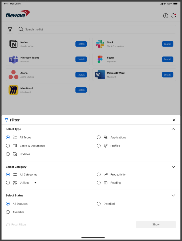
Browse Payloads/Filesets
The "Browse Payloads/Filesets" screen is a central feature within the app that enables users to explore and discover a diverse array of Payloads/Filesets available for access or download. Much like the experience of browsing through the Android Play Store or the Apple App Store, this screen offers users an organized and visually appealing interface that showcases different Payloads/Filesets, each accompanied by relevant details and information.
Key components and elements commonly found on the "Browse Payloads/Filesets" screen include:
-
Company Logo: The visual representation of the company's logo, reinforcing brand identity and providing a familiar visual reference.
-
Device Information: A button leading to the "Device Information" page provides users with quick access to essential insights about specific devices, such as company details, enrollment information, verification status, and app version.
-
Payload/Fileset icon: Each Payload/Fileset is represented by icon that provides a visual cue of its content or purpose.
-
Payload/Fileset Name: The name of the Payload/Fileset is displayed alongside the corresponding thumbnail. This gives users a quick understanding of the payload's/Fileset's context.
-
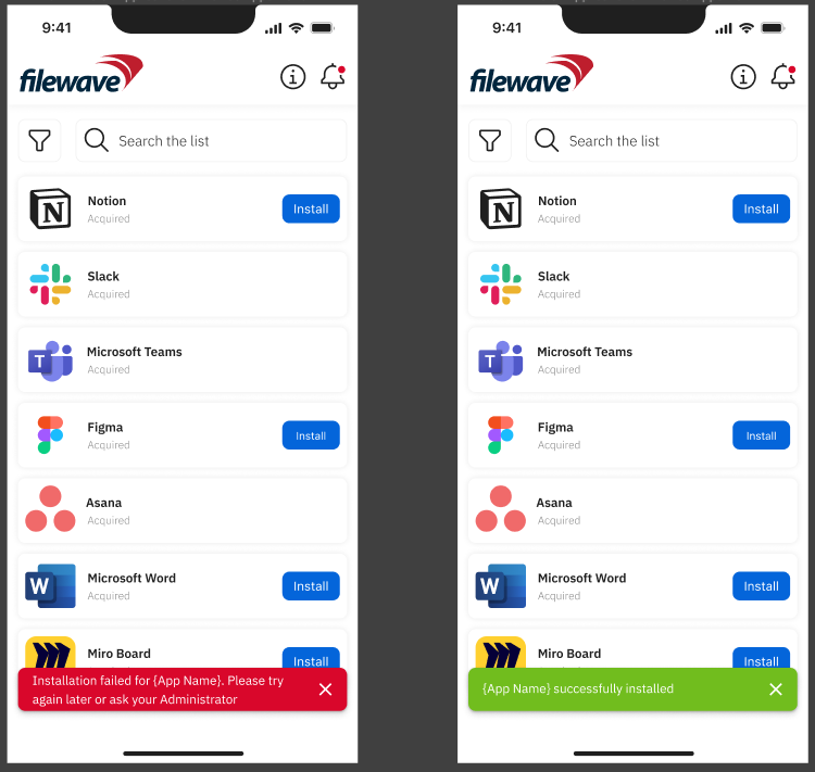
Install Button: This view includes an "Install" button that users can click to initiate the installation process of the selected Payload/Fileset, streamlining the user's interaction and providing a clear call to action. If the Payload/Filesets is already installed, button will not be visible.
-
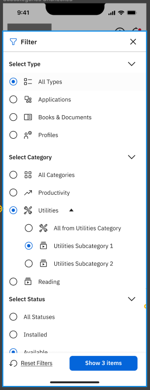
Category Filters: Users can typically filter Payloads/Filesets by Types such as "Applications," "Books," "Documents," and more. Filtering is possible by Categories (these should be configured in FileWave Central) and also by Status (Installed, Not Installed). This categorization helps users narrow down their search based on their specific interests.
| iPhone | iPad |
 |
|
- Search Bar: A search bar allows users to directly search for specific Payloads/Filesets by their name.
- Payload/Fileset Cards: Each Payload/Fileset is usually presented as a card containing its icon and name. Tapping on a card leads to a more detailed page for the Payload/Fileset.
- Pagination: If there are numerous Payloads/Filesets available, an infinite scrolling mechanism helps users navigate through multiple pages of listings.
- Access/Download Button: A clear button to access or download the Payload/Fileset is generally included on each card, allowing users to initiate the relevant action seamlessly.
- Scrolling Animations: Fluid scrolling animations and transitions contribute to a smooth browsing experience, enhancing users' engagement while exploring different Payloads/Filesets.
- Loading Animation: During data retrieval, a loading animation provides users with visual feedback, indicating that the app is actively fetching and populating the content.
- Error Handling: Robust error handling mechanisms ensure clear and user-friendly error messages guide users in case of connectivity issues or technical glitches.
- Landscape and Portrait Views: The screen seamlessly adapts to both landscape and portrait orientations for iPad, while for iPhone only portrait orientation is available, ensuring a consistent and optimal browsing experience across different device orientations.
| iPhone | iPad |
|
|
|

The "Browse Payloads/Filesets" screen serves as a gateway for users to immerse themselves in the app's content ecosystem, allowing them to discover and access various Payloads/Filesets that align with their needs and interests. Its design, layout, and functionality play a crucial role in delivering a user-friendly and enjoyable browsing experience, reminiscent of the fluid exploration on the Android Play Store and the Apple App Store.
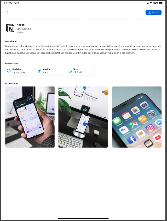
Payload/Fileset details view
The "Details View" is the screen that users encounter after clicking on a specific Payload/Fileset they wish to install or access. This screen provides comprehensive information about the selected Fileset, offering a deeper understanding of its features, functionality, and relevance. Much like the detailed view of an app in the Android Play Store or the Apple App Store, this interface is designed to empower users to make informed decisions about their installation or usage.
Key elements and components often present on the "Details View" include:
-
Fileset/Payload Icon: The icon representing the selected Payload/Fileset, serves as a visual identifier for users.
-
Fileset/Payload Name: The name or title of the Fileset, providing clarity about the content or purpose.
-
Creator Information: Details about the developer, creator, or source of the Fileset, establishing credibility and context.
-
Description: A comprehensive description of the Fileset's functionality, features, and benefits, outlining what users can expect.
-
Information: Provides information regarding when was Fileset last updated, and what is the version and size of the Fileset.
-
Screenshots or Previews: Visual representations of the Fileset's interface, content, or use cases through screenshots or short videos.
-
User Interaction Buttons: Buttons to perform actions - "Install" enabling users to initiate the desired action. Once the Install is triggered, the button will change state to show the progress of the installation. Once the installation is complete - the button will disappear, but a new field “Status” will be shown which will give final information about the status of the Fileset.
-
Return to Browse: A back button to return to the previous "Browse Payloads/Filesets" screen for further exploration.
-
Scrolling Animations: Fluid scrolling animations and transitions contribute to a smooth browsing experience, enhancing users' engagement while exploring different Payloads/Filesets.
-
Loading Animation: During data retrieval, a loading animation provides users with visual feedback, indicating that the app is actively fetching and populating the content.
-
Error Handling: Robust error handling mechanisms ensure that clear and user-friendly error messages guide users in case of connectivity issues or technical glitches.
| iPhone | iPad |
|
|
|

The "Details View" enriches the user's decision-making process by providing an in-depth look into the selected Fileset's attributes. By offering clear explanations, visuals, and relevant information, this interface ensures that users can confidently proceed with the installation or access of the chosen Fileset, enhancing their overall app experience.
Device Information view
The "Device Information" page provides a comprehensive overview of essential details about a specific device, enhancing transparency and management within the app's ecosystem. This page showcases crucial information related to the device and its integration, allowing users to make informed decisions and take necessary actions. The following information is displayed:
-
Company Logo: The visual representation of the company's logo, reinforcing brand identity and providing a familiar visual reference.
-
Company Name: The name of the company associated with the device, establishes a clear connection between the device and its ownership.
-
Address: The address of the company, providing users with a means to locate or contact the company physically.
-
Phone Number: The contact phone number of the company, offering users a direct channel for communication.
-
Email: The email address of the company, providing an electronic means of communication and support.
-
Enrollment Information: Details about where the device was enrolled, indicating the source or method through which the device became part of the app's ecosystem.
-
Last Verification Date: The date on which the device was last verified or confirmed as operational, enabling users to monitor the device's status.
-
Verify Device Button: A prominently displayed button that allows users to manually trigger a device verification process, ensuring real-time validation.
-
App Version and Build Number: Information about the version and build number of the app installed on the device, indicating the current state of the application.
| iPhone | iPad |
|
|
|
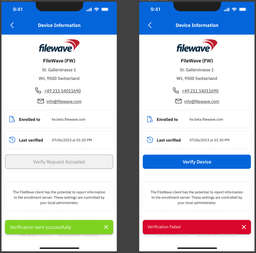

The "Device Information" page serves as a valuable tool for users to gain insights into the device's ownership, enrollment history, status, and app-related details. By presenting this information in a user-friendly manner, the page enhances user management and facilitates seamless interactions within the app's ecosystem.
Logo and primary color selection
The Adding Logo and Primary Color Selection feature enhances customization within the app by enabling users to personalize the visual representation of their profiles or entities. This feature allows users to define their brand identity and establish a cohesive look and feel throughout the app. Here's how the feature works:
-
Logo Upload: Users can upload their company or entity logo, which serves as a distinctive visual identifier. The logo could be in various formats, such as JPEG, PNG,... Once uploaded, the logo is displayed in relevant sections of the app where the user's profile or entity is showcased.
-
Primary Color Selection: Users can choose a primary color that resonates with their brand's identity. This color becomes the dominant hue used for interface elements such as buttons, headers, and accents throughout the app. Users can select the color from a color palette or enter a custom color code.
-
Visual Consistency: The uploaded logo and selected primary color are applied consistently across various sections of the app. This ensures a coherent and visually pleasing experience for users and anyone interacting with their profiles or entities within the app.
-
Personalization: By allowing users to upload their logos and select a primary color, the app offers a personalized touch, making users' presence and contributions stand out within the app's environment.
-
Branding Impact: The combination of a unique logo and primary color strengthens brand recognition and recall, creating a strong visual association with users' profiles or entities.
-
User-Friendly Interface: The process of adding a logo and selecting a primary color is designed to be intuitive, with clear instructions and user-friendly controls that guide users through the customization process.
-
Flexibility: Users can update or modify their logo and primary color selection at any time to reflect changes in their branding or preferences.
The "Add Logo and Primary Color Selection" feature empowers users to infuse their identity into the app's interface, enhancing recognition, and contributing to a personalized and engaging experience for both users and their audiences.


How do I change the logo and primary color? It's easy if you follow this guide: Setting the Primary Color, Name and Logo in Kiosk/App Portal (15.3+) but if you are a Hosted customer, you will need Customer Technical Support to help you because you'll need to change files on the server itself.
No Comments